
Modifying Top Row Modules in Headers 9 – 20
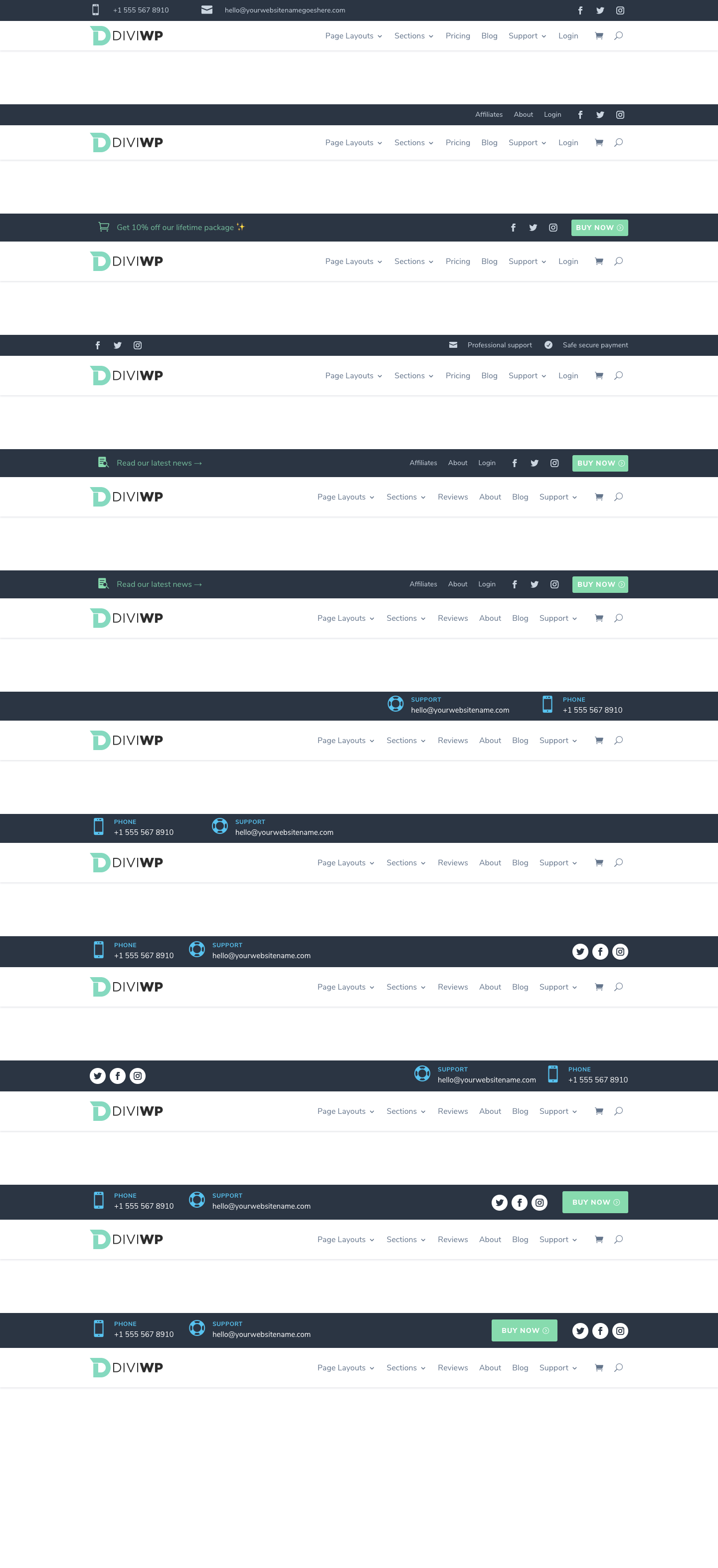
Header Sections 9 – 20 include rows that use a combination of Blurbs, Menus, Social Follow and Button Modules. Here they are starting with Header Section 9 and ending with Header Section 20:
Because the default width has been maintained for the Row with the Menu Module (1080px), the top Row column uses hardcoded max-width and width settings to line up correctly with the Menu Row.
This technique enables the row to have a customizable fullwidth background color while still being positioned within one main Header Section. This is important for Sticky or Fixed options.
If you would like to use a fullwidth menu row then you can simply edit the the Custom CSS property to match your width values or you can remove the max-width and width setting and experiment with your own designs.
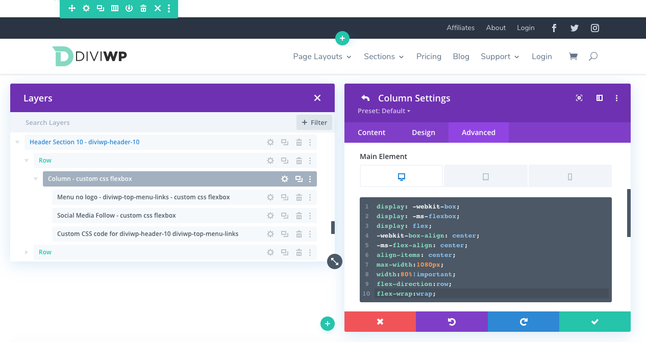
In the above screenshot, you can see how the max-width is set to 1080px and the width to 80% along with Flexbox properties to align the modules within it’s column.
You can also see how each Modules’s Admin label references – custom css Flexbox. This indicates the module has Divi’s built-in Custom CSS option via the
Settings → Advanced → Custom CSS
You can experiment with or remove those values or you can even remove the row entirely.
Add your existing custom designed to the Section.
I’m working on a juicy resource for using Flexbox with Divi which will be referenced soon!