New Layouts and Sections: 10 Landing Page Layouts, 45 Card Sections and over 400 Buttons!
We are very excited to publish our next batch of highly requested Layouts and Sections for you – Landing Page Layouts, Card Sections and Button Sections
We’ve had Landing Pages marked as “coming soon” for some time now and that’s because they’ve undergone so many rounds of design, section and copy testing iterations.
We wanted to get them right and make them as useful and flexible for you as possible. Each landing page layouts includes all the building blocks you need to create high converting landing pages and includes beautifully designed Hero Sections, Newsletter Forms, Contact Forms, Features Sections, Testimonial Sections, Call to Actions Sections and more.
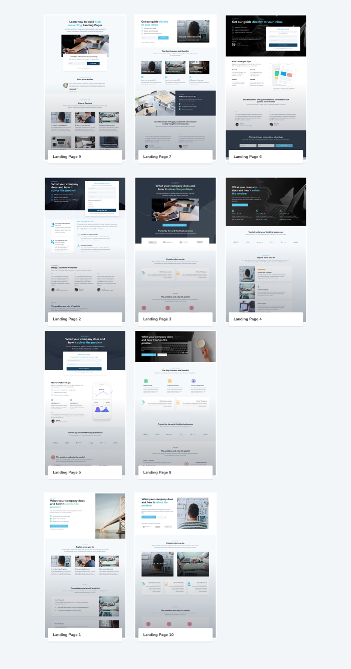
10 New Landing Pages across 3 different categories
We’ve grouped these landing pages into 3 separate types or categories and we’ll be adding more categories and layouts to each of them over time:
- Email Signup Page Templates
- Lead Generation Page Templates
- Sales Page Templates
Each layout is positioned within one of these categories because they have been designed to facilitate a single desired action:
- Email Signup Page Templates → Submit an email address via a form submission in exchange for something. This could be an ebook, brochure, report, white paper, coupon, newsletters and more.
- Lead Generation Page Templates → Submit an email address and more information via a detailed form submission in exchange for a brochure, a phone call, to book an appointment, request more information (especially for service businesses) and more.
- Sales Page Templates → Purchase a product, software as a service (SaaS), an ebook, an online course, premium newsletter subscriptions, tickets, services and more.
Each landing page layout has been specifically structured to persuade visitors to perform the actions outlined above.
This means each section fulfils a specific task, be that establishing credibility via testimonials to outlining the pain and highlighting the benefits. As a user scans down the page, specific call-to-actions (CTA) Sections prompt the user to perform the desired action.
That’s what makes Landing Pages convert so well – there’s one goal and one consistent CTA. Here’s a screenshot of all the landing pages, you can view them all, along with their demos, on the Landing Pages page.
We’ll be exploring Landing Page concepts and more in our upcoming Landing Page Series so for now here’s a brief introduction as to why we’ve included sections that outline the pain or problem your product, business or service solves.
Focussing on the pain
One of the biggest mistakes businesses make with landing pages is not outlining or agitating the pain, frustration or problems their potential customers might be experiencing.
Sometimes customers aren’t even fully aware of this pain so it’s the landing pages job to draw attention to it, define it and outline how current solutions fall short of solving it.
In his book “Building a StoryBrand”, Donal Miller writes: “When a customer realizes they have a lot in common with a brand, they fill in all the unknown nuances with trust.”
Empathising with the visitor’s pain through the use of emotional language helps to build this rapport with visitors and gain their trust.
Once you’ve agitated the pain, you can now present your product, service or business as the solution to helping them succeed by removing the pain or frustration they’ve been experiencing.
This a powerfully persuasive technique and increases the chances of them converting.
We’ll dive into practical examples of types of pain, with examples, in our upcoming Landing Page series.
Helper copy/text to guide you along the way
Each Landing Page Layout includes “helper” text/copy for all the headlines, sub headings, bullet points and descriptions within each section.
This helper text is designed to get you thinking about conversion optimised copy and prompts you to think about writing copy that your visitors will understand and benefit from.
This takes the guesswork out of wondering what you should write in the first place but you’ll still need to do work of applying it to your own use cases!
Fast, Flexible and Mobile Optimised
These landing pages have been designed with speed in mind. You won’t find any fancy animations or unnecessary elements.
The focus is on guiding the user through a journey and then providing them with an easy path to perform an action. This makes for an optimal landing page user experience.
You can also mix and match Sections or remove Sections entirely to suit your needs. For example, you might decide that the Testimonial Section is displayed too early on the page and you’d rather describe the Features or How it Works Sections before establishing credibility through Testimonials.
You can even substitute sections for other DiviWP Sections and import Pricing Sections, Blurb Sections or Interactive Sections to compliment your customised Landing Page layout.
Just remember – keep the focus to one single CTA and try to avoid information, content or links that will compete with the users attention and the journey you are taking through as they scan down your page.
45 Card Sections with even more on the way
We’ve got a whole post dedicated to the 45 beautifully designed Card Sections so we’ll keep this introduction fairly brief.
A Card is a User Interface (UI) design pattern that organises and groups content or information in an easily scannable manner. These specific chunks of information mimic a physical card-like appearance which users appreciate because it aids for scannability. Users don’t read, they scan.
We’ve designed a range of sections which include individual blurb cards, row cards and column cards. They use a combination of image, blurb, text and button modules to present content in a cognitively-friendly way because the user doesn’t have to exert effort reading vast amounts of text and can process information faster.
They’re also beautifully responsive and can be used in a range of contexts on a variety of page designs.
There are 45 Card Sections to explore. Here’s a looooooong screenshot of all the Card Sections. Keep scrolling down to view the rest of the post!

We’ll dive into all the features of these Card Sections in the upcoming post!
Over 400 individual Button Modules
We’ve released a range of Button Sections with individual Button Modules that you can simply copy and paste into your designs using Divi’s Copy Module functionality.
These include pills and badges along with a range of styles which each include options for icons positioned left or right or with no icons at all.
We’ve also included subtle hover effects that offer queues to the visitor that the button is clickable and can be dropped into your existing designs just by copy and pasting.
Here’s a screenshot of all of all the Button Sections :

More on the way!
I assure you that we’re hard at work creating even more Layouts and Sections that you’re going to love. Keep an eye out on the blog for our upcoming posts.
I really hope you like the new updates! 🙌
P.S I thoroughly enjoyed listening to Nick Roach, the CEO of Elegant Themes, and Kenny Sing, Design Director at Elegant Themes, on their recent appearances on the excellent Divi Chat YouTube channel.
They talk about the upcoming performance improvements, new features in the works and laying the foundation for a redesigned, faster, more intuitive and feature-packed Divi.
If you want to get excited about the future of Divi then give them a listen and you won’t be disappointed:

0 Comments